{{ p.title }}
{{ p.body }}
Travel · Consumer Booking Platform
A premium vacation-rental platform that helps travellers discover and book unique holiday homes across Spain — with confidence at every step.

The Ruralidays homepage — inspiration first, search second, trust made visible from the very first screen.
02
Project overview
Ruralidays lists thousands of rural and coastal homes across Spain. Search felt heavy, trust signals were buried, and the booking flow lost people at payment. My job was to make discovery effortless and booking trustworthy — for guests who commit before they ever step inside.
Turn browsing into booking — more reservations without discounting the brand.
Owned the experience end to end, from research to the design system.
One designer with a product manager and two engineers.
Three months, research through developer handoff.
Responsive web & iOS flows, plus a reusable design system.
Discovery and trust drive bookings more than another filter ever could.
03
Design principles
{{ p.body }}
04
Customer journey
05
Homepage experience
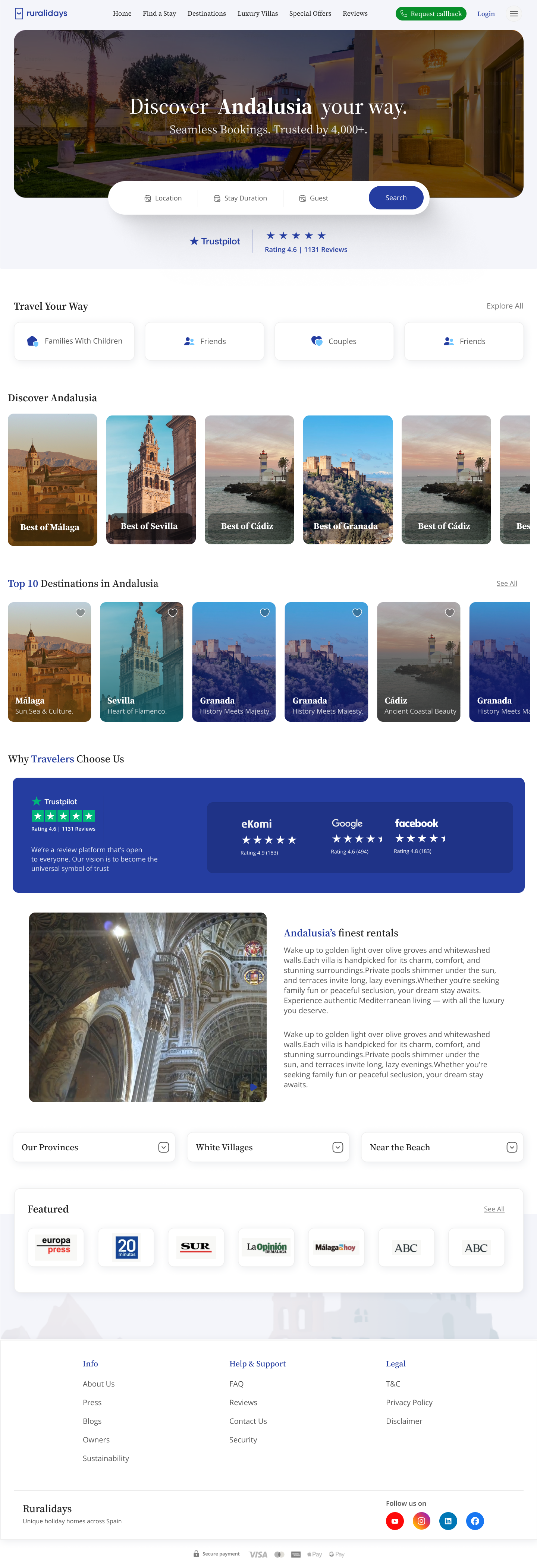
A full-bleed destination image sets the mood, a single search bar keeps the entry simple, and Trustpilot ratings land credibility before the scroll even begins.
Scroll within the frame to explore the full homepage.
06
Discovery experience
Where, when and who — everything else stays one tap away. Results sit on the left, a live map on the right, and property cards carry the photo, price and rating that decide most bookings.
{{ f.body }}
07
Booking experience
Gallery, amenities, reviews and host read down one calm page while a sticky booking card keeps price and dates in view. Checkout then asks for one thing at a time, showing the running total and confirming before it ever charges.
Mobile checkout
08
Responsive & design system
A small, disciplined kit — one type pairing, a tight palette and a single card radius — kept the experience identical across every screen size.
09
Challenges & learnings
{{ c.body }}
{{ c.solved }}
What I took away
People don't book a house. They book the feeling that nothing will go wrong.
Discovery gets someone interested, but trust is what closes the booking. Designing for that feeling — clear prices, honest photos, a visible review step — moved more than any new filter could.